Contrasting Signs With a Shared Concept
30 September, 2022
As we go about our daily lives, we are exposed to an ever-increasing amount of brands, logos and symbols.
In fact, in 2007, market research firm Yankelovich surveyed 4,110 people and discovered that an average person sees up to 5,000 adverts each and every day. This number is thought to have significantly increased since due to the proliferation of digital touchpoints.
It’s quite overwhelming when you think about it. All of these brands and logos are competing for our attention in both the physical and digital space, but which ones do we actually remember? Which ones truly evoke an emotional reaction?
For me, there are two favourite symbols, both at totally different ends of the spectrum in terms of the environments they find themselves in, yet both have significant emotional value thanks to the memories of journeys and adventures that they bring to mind.
Double Arrow
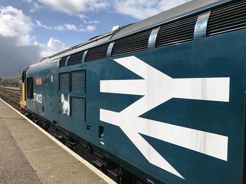
Designed by Gerry Barney in 1964 while at the Design Research Unit, the Double Arrow made up part of the British Rail Corporate Identity Manual alongside Jock Kinnear and Margaret Calvert’s Rail Alphabet typeface.
Since its release, the ubiquitous Double Arrow has gone on to become a true design icon, seen across the rail network on tickets and uniforms, station signage and locomotives. The beautiful simplicity means it is just as at home on the cavernous city centre station concourses as it is in the quaint rural stations scattered across the length and breadth of Britain.
The Double Arrow is more than just a revered piece of graphic design work; to many people it evokes childhood memories of holidays, school trips and journeys to the city. Seeing the Double Arrow signage on the approach to a station creates a sense of excitement as we anticipate what lies ahead on our coming journey.
National Trails Acorn symbol

The National Trails are a series of 15 long distance footpaths and bridleways spread throughout England and Wales. The trails are marked by a simple Acorn symbol, that usually adorns a timber finger sign, post or other makeshift countryside waymarker.
I’ve spent countless hours walking, hiking and running along these trails, along the windswept Norfolk Coastal Path, up stretches of the much hillier Pennine Way and chasing the sunrise across 103 miles of the North Downs Way.
During every journey along these trails, the Acorn signage is there to act as a guide. Its presence, despite being unassuming in structure and small in size, is reassuring and comforting. It evokes a sense of the outdoors, fresh air and space. Seeing the Acorn instantly brings back memories of adventure, camaraderie, struggle and achievement.
Contrasting Signs With a Shared Concept
Both symbols are found in very different surroundings, and in different physical spaces.
However, a common theme links the two; a great symbol combined with a well-executed, fit-for-purpose signage scheme elevating a brand to a whole new place in the human psyche. With this, the logos stop being just another bit of visual ephemera ignored by tired eyes in over busy environments. Instead, they can become memorable, emotive and evocative.


The latest news, articles and resources, sent to your inbox monthly.